Friday, December 14, 2012


Times up! Heralding in a New Age
Mixed Media Digital Print (2012)
594 x 420 mm

‘Times up! Heralding in a New Age’ is a mixed media digital artwork which represents the notion of digitisation in relation to the way news is accessed and read. Numerous techniques and elements were manipulated by the artist to present a statement about the demise of print news, posing questions about the future of reporting within a digital landscape.

Both human and computer processes were used to combine and juxtapose several material artefacts with their digitalised counterparts to create a cohesive, yet chaotic image, which evoked emotions towards the process of digitalisation. The final media of the artwork consisted of a 594 x 420 mm digital print on high gloss paper. Aesthetically, the foreground features a large skeletonised hand which reaches towards a pixelated left corner, situated on a black, white and red abstract background. The medium of the background consisted of acrylic paint on collaged news print, whilst the hand was photographed and digitally altered, before all layers were combined using a range of filters.
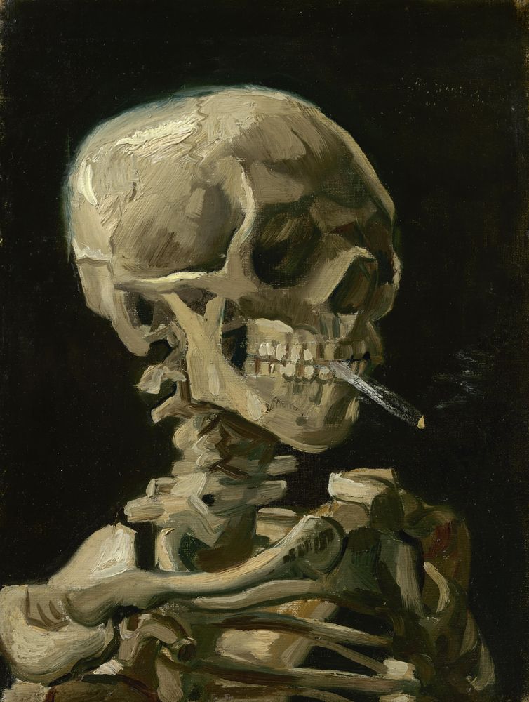
Several art movements and artists have influenced the artwork, including the Post-Impressionist movement and Van Gogh, whose work was characterised by short brushstrokes of broken, bright colour to define form, evident in the painting ‘Skull with a Burning Cigarette’ (Parr, 2012). The macabre use of dark background contrasted with a bright yellow skull, informed the selection of the equally sombre colours in my artwork, whereby the fleshy, yellow hand was contrasted against the chaotic background (Miller, 2010). Colour was a dominant element within the piece, with black and white used to symbolise the conflict of digital and material worlds, whilst also being symbolic of the dull colours of news print. Red was introduced to symbolise death and the bleeding of the newspaper. Together the three colours enact the pun ‘black, white and red all over’ with the cliché losing meaning within the future digital climate.

Shape was another major element within the art piece, with the irregular and jagged forms inspired by Abstract Expressionism, a 1940’s movement characterised by abstract forms whereby line and colour were detached to depict and transcend physical space (Roche, 2009). In particular, Jackson Pollock’s technique of flicking paint was used to create the harsh shapes, to evoke a chaotic tone and symbolise a changing world  (The Art Story Foundation, 2012). The emotive strokes incite feelings of anger and despair reminiscent of the employees whose jobs are at risk. This is juxtaposed with the even squares in the left corner which represent pixels as newspapers become digitalised, with the ordered and structured forms suggesting a lifeless future and the immediate and factual reporting of online news.

Emphasis has been used through the incorporation of an exaggerated hand, reaching towards the pixels and appearing as the focal point of the painting. Depicted in yellow, it appears to be aging, with details of newsprint and bones appearing through it and adding layers of rough textures, also synonymous with age. This again depicts death, as humanity attempts to reconnect with the digital world and depart the physical print news. Movement has been created by depicting a pointing hand, reaching towards the pixels, to lead the viewer’s eye towards the digitalised future, whilst ensuring a coherent and harmonious artwork through the connection between the two layers. This also disrupts the symmetry of the artwork, to add to the chaotic tone. Behind the hand, the word ‘Dumped’ has been emphasised, again evoking connotations of the newspapers being left behind.

Contemporary digital art provided the inspiration and the tools to create a cohesive artwork. Joseph Nechvatal uses technology to create symmetrical images which have been multilayered to create balance (Lewis, 2003). This informed the combining of layers which were asymmetrical to create a feeling of chaos in the artwork. Digital filters enabled the creation of a rough texture and a grainy feel, to symbolise decay and ageing. The final media of the painting was high-gloss paper, which highlighted the digitalised processing and again referred to the digitalisation occurring for both print news and art.

My artwork responds to the socio-cultural change of digitalisation, particularly focusing on the demise of print media. It is intended to challenge the viewer to question whether the newspaper will survive or whether it will be consumed by the digital age. Overall, it is a cohesive artwork which manipulates design elements to represent the changing and technological world we live in. 


References

Lewis, J. (2003). Joseph Nechvatal at Universal Concepts Unlimited. Art in America , 123-124.

Miller, D. W. (2010). Art work: Skullduggery. Retrieved November 30, 2012, from Madness of Art: http://madnessofart.com/tag/amsterdam/

Parr, S. (2012). Sue's Doodles. Retrieved November 30, 2012, from Research point: Artist’s depictions of skulls: http://suesdoodles.wordpress.com/2012/11/10/research-point-artists-depictions-of-skulls/

Roche, M. (2009). An Analysis: No. 1 (Lavender Mist) – Jackson Pollock. Retrieved December 2, 2012, from Metamorphisis: A Landscape: http://metamorphosisalandscape.wordpress.com/2009/08/21/an-analysis-no-1-lavender-mist-jackson-pollock/

The Art Story Foundation. (2012). JACKSON POLLOCK. Retrieved December 2, 2012, from The Art Story: http://www.theartstory.org/artist-pollock-jackson.htm

Thursday, December 06, 2012

Finally placed the finishing touches on my artwork!
I combined the two layers of the hand and background in photoshop and used a transparent eraser to blend the two layers together. This ensured the layers combined to create a seamless image. I decided to use an asymmetrical balance to prevent the image becoming too structured and formal, however, as I still wanted it to be aesthetically appealing I applied the rule of thirds. 
This was the completed product.


I decided that the hand looked very dull. Whilst it was quite realistic, I wanted to draw on the vibrancy and fleshiness of Van Gogh's painting 'Skull with a burning cigarette', so I played with the contrast and colour balance. This made a very high-contrast, attention grabbing image.
I was happy with this final product and like how adjusting the midtones, made the hand stand out more. It now has a slight 3-D effect, whereby the hand is reaching out of the paper. The only thing I want to change is adding more pixels down lower, so the hand is reaching out towards them.
Now I have my completed artwork I need to consider how I am going to present it. I have decided to have it printed onto high-gloss paper. This will again represent the transformation to the 21st century technologies, with the high-gloss printing far superior to the dusty newspaper pages of the past.
I plan to have it enlarged to A2 size for dramatic effect.

I have titled my artwork 'Times up! Heralding in the new Age' drawing attention to the subject matter of newspapers through the use of puns incorporating the titles of three renowned newspapers.

Overall, I am happy with my final product and looking forward to showcasing it at the class exhibition.

Tuesday, December 04, 2012

I originally wanted to use a skull to symbolise death, however I feel it holds little relevance to the image. Thus I am going to replace it with a hand, in order to represent the death of the physicality of the newspaper and also symbolise the hand which turns the pages. At the moment I am envisioning a large hand, serving as the focal point of the image and stretching towards the pixels,  as a secondary point of emphasis and working as a lead line. I still want to draw on Van Gogh's influence to create a yellow hand, to represent age, further symbolised by bones in reference to a skeleton. I also would like to add details of newsprint to emphasise what the hand represents; the death of print news.
In order to create the hand, I drew on Nechvatal's digital art and decided to use photoshop to digitally manipulate a hand. The first thing I did was take a photo of my hand stretching out towards the camera. I used a low aperture, to create a shallow depth of field, in order to give the perception that the hand is reaching out. I want to place it on the background so that the hand appears to be pointing to the 'pixels' in the corner of my art work. This will symbolise stretching out to the future as the newspaper becomes more digitalised.


I then deleted the unnecessary background and layered a photograph of crushed paper and my original newspaper collage over the top. This gave the skin a wrinkled appearance as well as subtly hinting at the newspaper subject matter of the artwork.


I then had to add the bones to the hand in order to skeletonise it. I used the same technique of layering images over the top, using a scan of an x-ray. However unlike the skull, it was unable to be simply layered on top as the hand was in the wrong position. Therefore I cropped each individual bone and used the rotate tool to change the perspective. Eventually I ended up with this image of the hand. 


I then set the bone layer to overlay so it would blend into the hand. 
 Finally, I adjusted the levels and colour balance to make the hand more yellow, in reference to Van Gogh's painting 'Skull with a Burning Cigarette'.

Now I just need to combine my final layers. Another day!


Friday, November 30, 2012


(Lewis, 2003)

Joseph Nechvatal is a contemporary Digital Artist; a movement which describes any digitally altered or created image. His work often involves using computers to create digital paintings which mimic traditional techniques  through the use of robots, photoshop or styluses (Lewis, 2003).  In addition, he has created animated works through inserting viruses which appear to attack his paintings. Nechvatal (2010) coined the term Viractuality to describe a connection between the virtual and biological; a now common phenomenon in today's technological world. One artwork I was drawn to was 'vOlumptuary droid decOllegtage' (2002) which challenges gender beliefs, through blurring male and female to create a Hermaphrodite. The artwork is a loose reference to the Roman poet Ovid’s sensual musings in 'Metamorphoses', which recites the birth of Hermaphroditus, from the parents Aphrodite and Hermes, resulted in the combination of both his parents; as in both male and female (Lewis, 2003). In the artwork, both male and female genitalia is depicted, using an abstract array of fractal patterns and programming code. Nechvatal uses binary code, comprised of zeros and ones, which represents contrast between the two spheres of gender. Similarly colour has also been used to express this conflict through the use of contrasting colours of earth tones and violet. Further polarities exist within Nechvatal's style which appears to be combination of abstraction and representation, something which I wish to replicate in my own work as I contrast the realistic element of the hand with the abstract background. I also want to draw on the technique of layering programming code, using newsprint instead, to add a further symbolic reference (Roniger, 2012)

Interestingly, Nechvatal features numerous holes in his works, depicting anuses, retinas and graphic holes and subsequently capitilies the letter O in the pieces title, symbolic for being open and in a ready position (Roniger, 2012)

Nechvatal has a fascinating interview found here


Lewis, J. (2003). Joseph Nechvatal at Universal Concepts Unlimited. Art in America , 123-124.

Nechvatal, J. (2010). Emergence of the New Paradigm: Viractuality. École Supérieure d'AudioVisuel (pp. 21-30). Toulouse, France: Université de Toulouse le Mirail.

Roniger, T. (2012). Interview with Joseph Nechvatal. Retrieved November 30, 2012, from Concatenations Blog: http://www.concatenationsblog.org/2012/03/interview-with-joseph-nechvatal.html

Thursday, November 29, 2012

Today I created the background of my image. I used the collaged newspaper sheet as a base and I then placed black and white paint over it, using water to gradually disperse the paint, drawing on water colour techniques. I used shape in the form of squares on the left side of my painting to represent pixels, as the newspaper becomes digitalised. The 'pixels' gradually become more prominent, until they are fully revealed in the left corner, symbolising the gradual change to newspapers until they are fully digitalised.

The medium I chose was acrylic paint, as I like how it is thick and fast drying and creates a high-contrast image.


I then drew on the techniques foregrounded in the movement of Abstract Expressionism, flicking black, white and red paint over the image. The irregular and jagged shapes created a chaotic image, which evoked the emotions of anger, as the newspaper nears its death. These emotions are also felt by those whose jobs are in this dying industry. The red splatters also represent blood, another representation of death and the bleeding soul of the newspaper.  Although I liked this effect, I thought the background lacked the references to the newspaper and therefore I ripped the word 'dumped' out of the newspaper and collaged it into the background. 


Although I am happy with my background, I think that it could be improved using Photoshop to increase the contrast and overall vibrancy. This would also represent the process of digitalisation, as the print news and my artwork become improved through technology. I will need to do some further research into digital artists in order to gather inspiration for this next process. 


Wednesday, November 28, 2012

My original plans to create the skeleton were to utilise watercolour on newspaper, however I have since discovered Digital Art and now decided to layer a skeleton over a face in order represent death and decay. I will talk about the Digital Art movement in a later post.
Although  my final artwork will probably utilise an image of a person related to newspapers, such as Rupert Murdoch, I used my own photograph for the experimentation.

I started by downloading an image of a skull from the internet, from ZME Science (2012).


I then cropped and rotated this image and placed it over the top of my face, before placing another layer of my face over the top; essentially creating a sandwich.
This allowed me to gradually rub out areas of my face using a transparent rubber, to reveal the skeleton underneath. Thus providing the effect of a partly skeletonised face. By keeping the other layer of my face underneath, I was able to retrieve components where necessary, by rubbing out the skeleton. This is the effect I finished up with.

ZME Science (2012). 'Skeleton'. Viewed 28th November, 2012. Retrieved from: http://www.zmescience.com/research/studies/american-skull-get-bigger-432143/

Monday, November 26, 2012

The background is an integral component of my image as it supports the focal point of the skull and depicts the transition to a pixelated future. My first thoughts about the background were to use watercolour to create blobs of colour which gradually become more square-like as they became digitalised. However, I have since discovered Abstract Expressionism and feel it could be used to represent the chaotic demise of print news.
Abstract Expressionism emerged in the 1940s as a departure from traditional painting conventions, techniques and realistic subject matter. Instead, abstract forms and colours were used to evoke emotion, with the artists favouring an improvised style of painting expressing emotion through energetic brush-strokes (The Art Story Foundation, 2012)

Jackson Pollock, an Abstract Expressionist painter, used the technique of flicking paint at a large canvas to capture the emotion of his subject matter and to detach line and colour in order to depict and transcend physical spaces. In Lavender Mist (1950), he depicts a western American landscape through the use of earthy colours, to create a lavender tone. Black and white have been used to create a balanced image and point of emphasis, with the viewer drawn around the edges of the canvas and given the feeling of a sparse landscape. The abstract forms add variety to the image to again depict the images of branches and sticks of plants covered in mist. This, therefore, does not only allow the viewer to 'see' the landscape, but also feel its chaos as Pollock's style transcends the physicality of realistic painting (Pioch, 2002). 


I want to use Abstract Expressionism as my background; however, I first want to experiment with the technique of flicking paint. A few weeks ago, I created a plaster cast of my face and hand, which I was going to use as an art sculpture, however I decided to revisit this artwork and flick paint on it. I decided to use bright colours as I wanted the self-portrait to be happy and selected the primary colours of red, green and blue to depict the building blocks of myself. This also makes it symbolic of my own art journey, whereby I can now use the basics in new ways. 


A practice of flicking paint. 


Pioch, N. (2002). Pollock, Jackson. Retrieved December 3, 2012, from Web Museum, Paris: http://www.ibiblio.org/wm/paint/auth/pollock/lavender-mist/

The Art Story Foundation. (2012). JACKSON POLLOCK. Retrieved December 2, 2012, from The Art Story: http://www.theartstory.org/artist-pollock-jackson.htm

Saturday, November 24, 2012

Today I started putting together the background of my image. I decided to try collaging newspaper strips, using a paper mache technique  I am not sure whether this will form the background of my image or whether I should build it up to create a 3D skull.

After letting the newspaper dry, the glue was not strong enough to hold the paper so it peeled off. I tried to glue it back down, with little success and the image does not look appealing. This is what I have ended up with. 


Not sure how I am going to overcome this yet. I think I will either have to use stronger glue or scan the image and just edit it on the computer. 

Friday, November 23, 2012

I have been considering using watercolour to paint the skull, as I am drawn to its transparent and liquid properties, which would create a 'sad' feeling. Watercolour painting involves using water-soluble pigments, often bought in tubes, and is used to create artistic representations on paper. Wet-on-wet is a particular technique whereby the pigment is applied directly to wet paper, subsequently allowing the colours to mix to form new shades and a fluid image (What is Watercolour Painting?, 2012). Marion Bolognesi is a watercolour artist who paints faces, often just the eyes and mouth, to capture the emotion, allowing the watercolours to drip and depict the image of crying eyes. This is contrasted with bright colours, an image of beauty, which hides the weeping soul (Marion Bolognesi Watercolour Faces, 2010).
 
This is my attempt at a watercolour painting, as inspired by Marion Bolognesi, where I tried to use colour to depict a mask hiding the crying insides of the girl. I decided to focus on the eyes, in order to create a minimalistic image, without distractions from other irrelevant facial features. As a critique, I think my choice of colours could be better chosen, possibly just using cool colours to express sadness. I also don't feel like I fully captured the emotion of the crying eyes. 


Marion Bolognesi Watercolour Faces. (2010). Retrieved November 23, 2012, from Trendland: http://trendland.com/marion-bolognesi-watercolor-faces/

What is Watercolour Painting? (2012). Retrieved November 23, 2012, from Wise Geek: http://www.wisegeek.com/what-is-watercolor-painting.htm


Thursday, November 22, 2012

After trawling through tumblr and photoshop tutorials, I came across a digital artwork which layered newspaper over a person and used watercolour filters to create a digitalised image (click here to view image). This sparked an idea that I could cover the death of print media,  very much a contemporary issue which addresses the changing and technological times we live in.

Newspapers have always been a primary source of facts and information, with many of us rising to our morning coffee and 'the paper'. The change and death of newspapers is not new, with the old days heralding the morning and evening versions of the paper as well as extras, whereby 'breaking news' was available as an extra piece of paper; 'extra, extra, read all about it'. Television also posed a threat to the paper, providing a more aesthetic approach to news; however, the newspaper survived, still providing a more comprehensive approach to the news accompanied with opinion and editorial pieces (Lark, 2007). However, today the accessibility and immediacy of digital news has changed the way we access information, making the death of newspapers a well documented phenomenon. Digital media overcomes issues faced with production costs, with the internet and its virtual pages being a free commodity. Rising prices and a changing market have seen staff reductions at major newspapers, including Fairfax Media and the Times in a drastic move to reduce costs. It seems the process of digitalisation is inevitable, as tablets provide a physical and portable version of the news and entirely replace the need for the paper.


Using this information I want to create an artwork which illustrates the death of print media and shows the evolution to its digitalised counterparts. At the moment, I am considering creating a mixed media collaged painting, which features a skull in the foreground, partly composed of newspaper, situated on a red, black and white background, which gradually becomes pixelated towards the corners. The colours will be drab, to represent the demise of print news, whilst red will be used to symbolise blood. These three colours are also a subtle pun referring to the riddle 'What's black, white and red all over?' referring to a newspaper. Whilst this joke is a cliche for our contemporary times, its meaning is set to become lost for future generations.

Preliminary Sketch


Jarvis, J. (2008). The Print Media Are Doomed. Retrieved November 21, 2012, from Business Week: http://www.businessweek.com/debateroom/archives/2008/12/the_print_media_are_doomed.html

Lark, A. (2007). The Beginning of The End for Newspapers. Retrieved November 27, 2012, from Andy Lark: http://andylark.blogs.com/andylark/2007/03/the_beginning_o_1.html


Tuesday, November 20, 2012

Today I stumbled across several  images of skulls which have influenced my thought processes and the development of my key concept. 

Skull with a Burning Cigarette

Van Gogh (1886)


(Miller, 2010)
Van Gogh was a post-impressionist painter, a movement characterised by bright colour and the use of short, sharp brush-strokes of broken colour to define form (POST IMPRESSIONISM, 2012). In particular, Van Gogh's painting 'Skull with a Burning Cigarette', uses this technique and colour to create a meaningful statement which remains relevant, due to its subject matter of smoking. At the time, he was studying at an art academy in Antwerp, where he wished to develop his skills of life-painting using live models, however the classes consisted of students copying prints and painting skeletons to learn about anatomy. Therefore, historians and art critics believe the painting was produced as black humour to ridicule the strict and conservative practices of the academy  (Miller, 2010). The painting implies connotations of death through the symbolism of the skull. The use of colour is realistic and highlights the macabre subject while hinting at the yellowing skin of smokers (Parr, 2012). The black background is used to foreground the skull and cigarette with its little swirl of smoke. Tone has also been used to create nuances of light and shadow and depict a realistic skull  (Vincent Van Gogh Style and Technique, 2010). For my artwork, I feel yellow could be used in a similar way to depict a skull and the process of ageing. I also feel the gritty brush-strokes could be used to create a sense of disjointedness towards a contemporary issue and either be replicated using acrylic paint or photo editing software. Contrasting colours could be used to foreground my central concept and focus the viewer's eye.

Mind over Matter

Dan Mountford (2011)


(The Work of Dan Mountford, 2012)


Dan Mountford is a contemporary artist and graphic designer, who specialises in double exposure photography. The photo 'Mind over Matter' is a strong statement about the addictive properties of the drug and the will-power required to overcome the habit. Double-exposure is used to juxtapose two images; the image of the boy and the cigarette butts which symbolise the pervasive properties of smoking (The Work of Dan Mountford, 2012). Texture has been implied through the use of realistic photography, whereby a small aperture has been used to allow a shallow depth of field and the subsequent sense of butts piling up and penetrating the brain. The colours are realistic, with a slight sepia tone to mimic the ageing process and, like Van Gogh, subtly hint at death and the yellowing skin of smokers. The photo has been composed to foreground the image of a boy against a plain background, whilst the profile shot has been used to clearly depict a person turning away, probably from his smoking past. The use of juxtaposition and symbolic choice of images could be used in my artwork to draw connections between death and death causing properties

After analysing these images, I am considering changing my focus issue to youth suicide and juxtaposing a skull with the causes of youth suicide. Double exposure could be used to overlay several images; most likely I could achieve this using photoshop, due to the complexity of combining several images. 

References


POST IMPRESSIONISM. (2012). Retrieved November 20, 2012, from Art Movements: http://www.artmovements.co.uk/postimpressionism.htm

Miller, D. W. (2010). Art work: Skullduggery. Retrieved November 30, 2012, from Madness of Art: http://madnessofart.com/tag/amsterdam/

Parr, S. (2012). Sue's Doodles. Retrieved November 30, 2012, from Research point: Artist’s depictions of skulls: http://suesdoodles.wordpress.com/2012/11/10/research-point-artists-depictions-of-skulls/

The Work of Dan Mountford. (2012). Retrieved November 20, 2012, from Juxtapoz: 
http://www.juxtapoz.com/Current/the-work-of-dan-mountford

Vincent Van Gogh Style and Technique. (2010). Retrieved November 29, 2012, from Artble: http://www.artble.com/artists/vincent_van_gogh/more_information/style_and_technique

Sunday, November 18, 2012

Urbanisation is a current issue with several implications, particularly pertaining to environmental impact. Drawing on Picasso, I have been considering creating an abstract image depicting a sparseness of houses, blocking out the sun. This image evokes the theme whereby the dark lifeless building reflects the heat of the sun. I like how colour has been used to evoke this imagery. 


Le pigeon aux petits-pois (1911)


(Art News: Lost but Not Always Found: The Paris Art Heist, 2010)

This painting was created during the Cubism movement which was characterised by the abstract dissembling of an image, creating numerous shapes, including cubes, to display the various angles and representations of an object. This required the artist to analyse and break up a scene, before reconstructing it in a new way(Art News: Lost but Not Always Found: The Paris Art Heist, 2010). Extensive use of shape has been used to create this effect and enables the viewer to develop a feel for the buildings in the Italian squares. The painting uses colour to capture the Italian scenes of a cafe and the typically yellow buildings and coutrysides, whilst grey has been used to show the flutter of pigeons.

Cubism could be used to show an abstract image of urban sprawl, depicting the roofs of houses using squares, with the addition of a focal point of black smoke. This would also symbolise the death of the trees, being replaced by more pollution. Warm colours could be used to represent the heat of the houses, reflecting the sun's rays.
This is a brief sketch of my plan.


References

Art News: Lost but Not Always Found: The Paris Art Heist. (2010). Retrieved November 23, 2012, from Oil Painting Express: http://www.oilpaintingexpress.com/category/blog-tags/pablo-picasso


Wednesday, November 14, 2012

For my art work, I have to respond to a contemporary issue. I will need to consider several aspects including subject matter, media and design utilising the elements and principles of design to create an emotive piece. So far I have been using tumblr for inspiration which is able to be viewed below. 

cracksandmirrors.tumblr.com


At the moment, I have thought about addressing several contemporary issues including globalisation, digitalisation, youth suicide and asylum seekers. 

As I work through this journey, I will continue to upload posts of my progress and the development of my concept. 
Sylvia.